Navigating the Nozzle: Enhancing Vaseline's Cap for Intuitive Use
Hello design enthusiasts! I want to share a UX story I took on to enhance the experience of using Vaseline cream in India. I noticed a small but significant issue with the cap design that confused me and my family, and I am sure other users as well.
Noticing the Need:
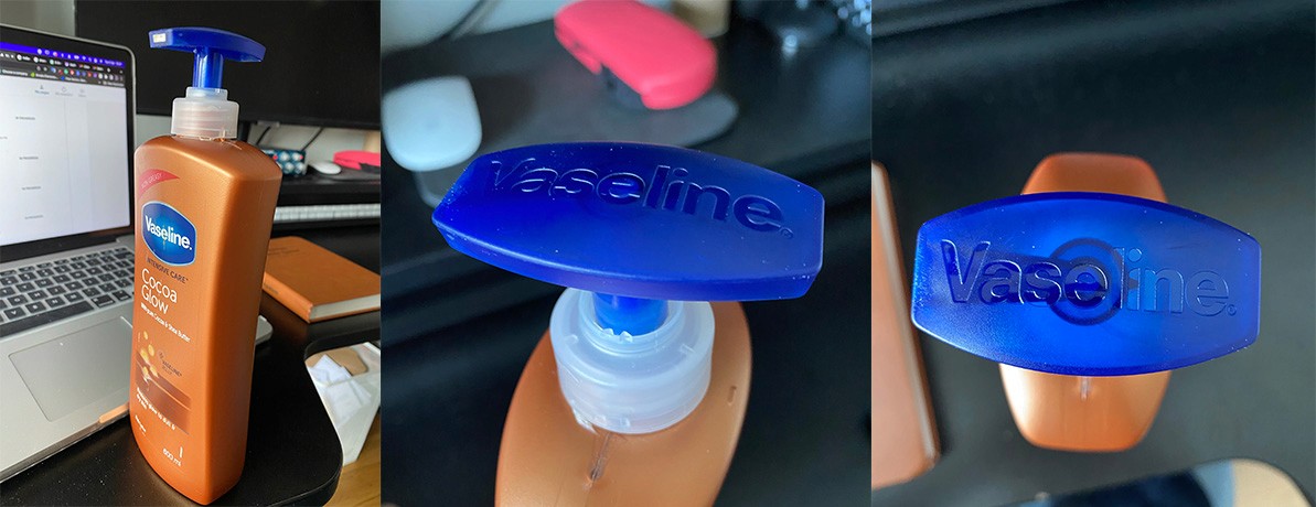
During my application exploration as a UX designer, I purchased a tub of Vaseline intensive care cream from India. Upon first use, I struggled to identify the correct side of the dark blue cap to press for dispensing. The lack of visual indicators created friction and a risk of accidental leakage.
Pinpointing the Problem:
Analyzing further, I determined the key issue was the solid color and lack of distinguishing cap features to guide proper opening. Without markings, icons, or contrasting spots, users are left unsure of which side of the nozzle cream comes out, resulting in a confusing and error-prone experience.
Proposing a Simple Solution:
To eliminate this UX flaw, a visual cue like a teardrop icon or arrow could help indicate the nozzle side. However, the existing solid navy blue color scheme on both sides of the Vaseline cap poses visibility issues with markings, especially in low-light conditions. Instead, a more intuitive solution would be altering the cap structure itself - shaping the nozzle side differently than the flat back. For example, modeling it after traditional cream tubs with oval depressions could enable users to intuitively identify and press the correct side by feel rather than sight. The nozzle area can gently slope inward, indicating its flexible function.
Improving Experiences Holistically:
This small but purposeful product modification exemplifies my broader UX approach - pinpointing areas of friction in customers' interactions and applying strategic design tweaks to transform confusion into delight. By considering the broader user journey, we can build minor advances that add up to major usability wins.
Identifying the Issue:
In the world of design, every detail matters. The cap of the Vaseline cream product lacked clear indicators, making it a bit tricky for users to figure out which side dispenses the cream. This led to a less-than-optimal user experience.
Closing Thoughts:
This journey has been an exploration of improving user experiences through thoughtful design solutions. As we continue to refine and innovate in the realm of design, let this be a testament to the impact that even subtle enhancements can have on the usability of everyday products.
Stay tuned for more insights into the world of user experience design and the quest for simplicity and clarity.
- Sreehas Sreejith
